Join GitHub today
GitHub is home to over 31 million developers working together to host and review code, manage projects, and build software together.
Sign upClarification around network diagrams #275
Comments
 ruebot
added
the
ux
label
ruebot
added
the
ux
label
Mar 25, 2019
This comment has been minimized.
This comment has been minimized.
|
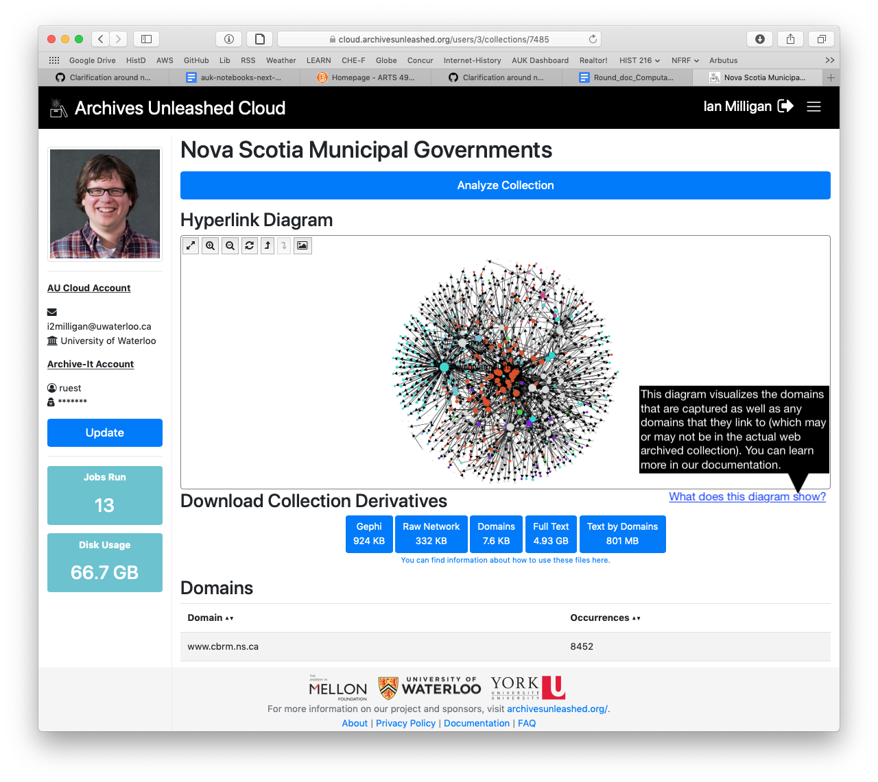
Hmm. Maybe a note in the documentation as well as a hover-over question mark icon to display some help text like we do with the derivatives? |
This comment has been minimized.
This comment has been minimized.
|
Could we be specific about what is the case (we capture every domain and create an edge for every link we find in the web page)? That is a limitation of the network graphs, since I think people imagine the archives to contain everything in Way Back. (That would be really nice, of course!) |
This comment has been minimized.
This comment has been minimized.
|
Just that what is being visualized is the domains that are captured as well as the domains that they link to (which may or may not be in the actual web archived collection). |
This comment has been minimized.
This comment has been minimized.
|
What about something like this?
|
This comment has been minimized.
This comment has been minimized.
|
That works for me! |
This comment has been minimized.
This comment has been minimized.
|
@ianmilligan1 I like that! @edsu does that work? |
This comment has been minimized.
This comment has been minimized.
edsu
commented
Mar 25, 2019
|
Thanks for hearing this part of the presentation, and dropping it in here. You guys are awesome. I like the explanation. I guess I was imagining (at least) two different types of users of this view.
Maybe it would need to be two views? It would be nice if the underlying derivative Gephi file had a property indicating whether it was crawled or not. Then it could be easy for people to examine... |
This comment has been minimized.
This comment has been minimized.
|
Adding a "crawled" or "domain"=1 attribute to the gexf would not be too expensive or difficult. Might be worth considering something in the sigmaJS to indicate a crawl as well (change the text size and/or colour? or the node shape?). |
ruebot commentedMar 25, 2019
During the Team Kompromat presentation at the DC Datathon, @edsu noted that the network diagrams can be misleading. One could assume that the network diagram represents what is in the archive itself that was analyzed. We should clarify that this is not the case. So, what's the best place to do it? A note on the diagram, something in the documentation? Something else?