Join GitHub today
GitHub is home to over 28 million developers working together to host and review code, manage projects, and build software together.
Sign upDifference between margins/cplot and predict()/plogis() for glm predictions and CIs? #92
Comments
 mark-williamson
closed this
Apr 6, 2018
 mark-williamson
reopened this
Apr 6, 2018
 leeper
added
the
question
label
Apr 13, 2018
This comment has been minimized.
Show comment
Hide comment
This comment has been minimized.
leeper
Apr 14, 2018
Owner
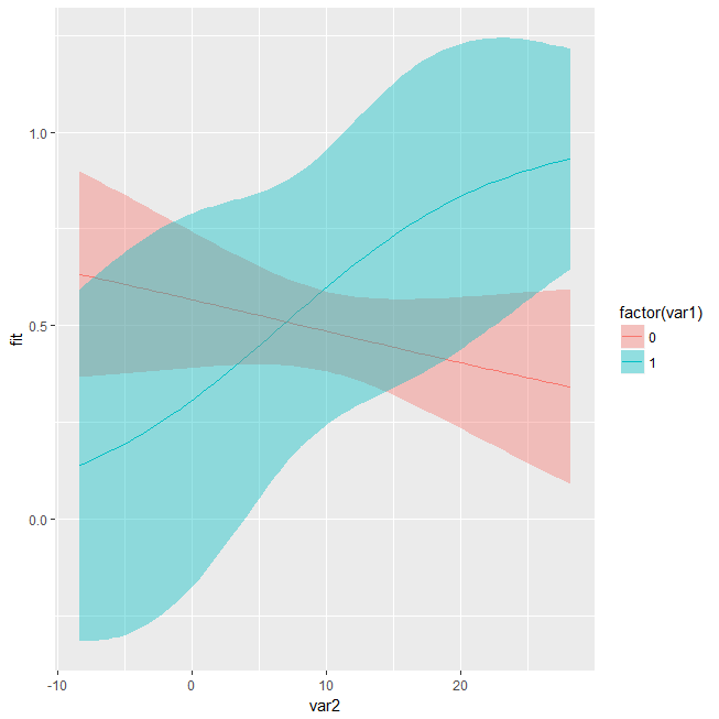
Well, I guess I'm not sure what the "correct" behavior actually is here. prediction::prediction() (which is working under the hood for margins::cplot()) is not doing any any substantive transformation here, it's just wrapping base predict() with type = "response" so any output that you get from prediction() (and thus from cplot()) should - and does - match what you would get from just working directly with predict():
pred <- data.frame(expand.grid(var1 = c(0, 1), var2 = seq(min(data$var2), max(data$var2), 0.5)))
pred <- cbind(pred, predict(m, newdata = pred, type = "response", se.fit = TRUE))
pred$UL <- pred$fit + (1.96*pred$se.fit)
pred$LL <- pred$fit - (1.96*pred$se.fit)
ggplot(pred, aes(var2, fit, fill = factor(var1))) +
  geom_line(aes(col = factor(var1))) +
  geom_ribbon(aes(x = var2, ymin = LL, ymax = UL), alpha = 0.4)
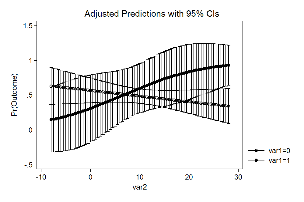
This is also equivalent to Stata's behavior on these example data:
use data.dta, clear
quietly logit outcome c.var1##c.var2
quietly margins, at(var2 = (-8(0.5)28) var1 = (0 1))
marginsplot
I suppose it's reasonable to expect a different output (akin to what you describe using plogis() and some googling suggests a fair amount of debate on what these intervals are and what you might want in a given circumstance. I'm totally open to suggestions on better behavior but as written, prediction() simply tidies the output of predict() rather than substantively modifying that output. If cplot() should do something different from the base behavior, I'm open to creating options for that, including changing the default.
|
Well, I guess I'm not sure what the "correct" behavior actually is here. pred <- data.frame(expand.grid(var1 = c(0, 1), var2 = seq(min(data$var2), max(data$var2), 0.5)))
pred <- cbind(pred, predict(m, newdata = pred, type = "response", se.fit = TRUE))
pred$UL <- pred$fit + (1.96*pred$se.fit)
pred$LL <- pred$fit - (1.96*pred$se.fit)
ggplot(pred, aes(var2, fit, fill = factor(var1))) +
geom_line(aes(col = factor(var1))) +
geom_ribbon(aes(x = var2, ymin = LL, ymax = UL), alpha = 0.4)This is also equivalent to Stata's behavior on these example data: use data.dta, clear
quietly logit outcome c.var1##c.var2
quietly margins, at(var2 = (-8(0.5)28) var1 = (0 1))
marginsplotI suppose it's reasonable to expect a different output (akin to what you describe using |
This comment has been minimized.
Show comment
Hide comment
This comment has been minimized.
strengejacke
Jun 25, 2018
I think the problem here is that type = "response" gives you the predicted probabilities, while type = "link" gives you the predictions on the log-odds scale (see ?predict.glm). Thus, the formula pred$fit +/- (1.96*pred$se.fit) won't work for predicted probabilities, as you need to back transform predictions and se, then do +/- 1.96*se and then back-back-transform. Or, you use type = "link", then you need to back-transform only once, after doing +/- 1.96*se. This ensures that predictions and CI are always within the correct (=possible) range.
strengejacke
commented
Jun 25, 2018
•
|
I think the problem here is that |
This comment has been minimized.
Show comment
Hide comment
This comment has been minimized.
strengejacke
commented
Jun 28, 2018
|
See a similar discussion here: glmmTMB/glmmTMB#324 (comment) |


mark-williamson commentedApr 6, 2018
•
edited
Edited 3 times
-
 mark-williamson
edited
 Apr 6, 2018 (most recent)
-
 mark-williamson
edited
 Apr 6, 2018
-
 mark-williamson
edited
 Apr 6, 2018
Hi @leeper, I have a question about what
margins::cplot()is doing under the hood and how it differs from the predicted values and CIs produced using the base functionsplogis()andpredict().In particular, I'm trying to plot the predicted values and uncertainty from a logistic regression with an interaction between a binary and continuous independent variables.
Using the regular
predict()function requires creating hypothetical data and predicting values on the "link" response scale and then converting them to probabilities usingplogis().When I attempt to create the same plot with
cplot(), I get different results for the CIs. Notably, the output seems to produce CIs that can fall outside of [0,1] bounds of predicted probabilities, whereas theplogistransformation guarantees the output will be bounded at 0 and 1.I'm sorry in advance if this question is simply a result of me misunderstanding the nature of predicted values for logistic models. Is this simply a matter of using the original vs. hypothetical data?
I've really enjoyed using
marginsand I'm just hoping to clarify what exactly it is giving me as output. Any advice is appreciated!