Join GitHub today
GitHub is home to over 36 million developers working together to host and review code, manage projects, and build software together.
Sign upSomehow highlight the FAQ/Archive-It connection better? #293
Comments
 ianmilligan1
added
enhancement
discussion
labels
May 1, 2019
This comment has been minimized.
This comment has been minimized.
 ianmilligan1
referenced this issue
May 9, 2019
Merged
Better Highlights Need for Archive-It Credentials, Resolves #293 #295
 ruebot
closed this
in
b4f5758
May 9, 2019
Sign up for free
to join this conversation on GitHub.
Already have an account?
Sign in to comment

ianmilligan1 commentedMay 1, 2019
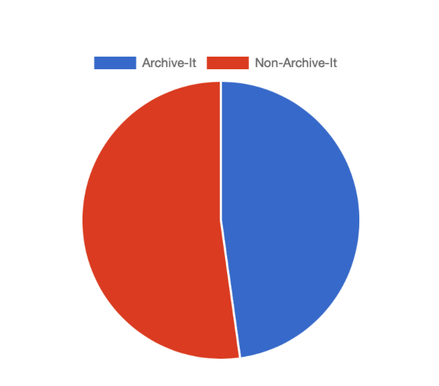
One point of continual confusion is that people who don't have Archive-It accounts sign up for our service, and are then understandably frustrated when they're not able to use it.
This is mentioned in the FAQ and deeper into our About page, but we should think about how to possibly highlight this better.
Some thoughts:
Thoughts from others?