PixPlot
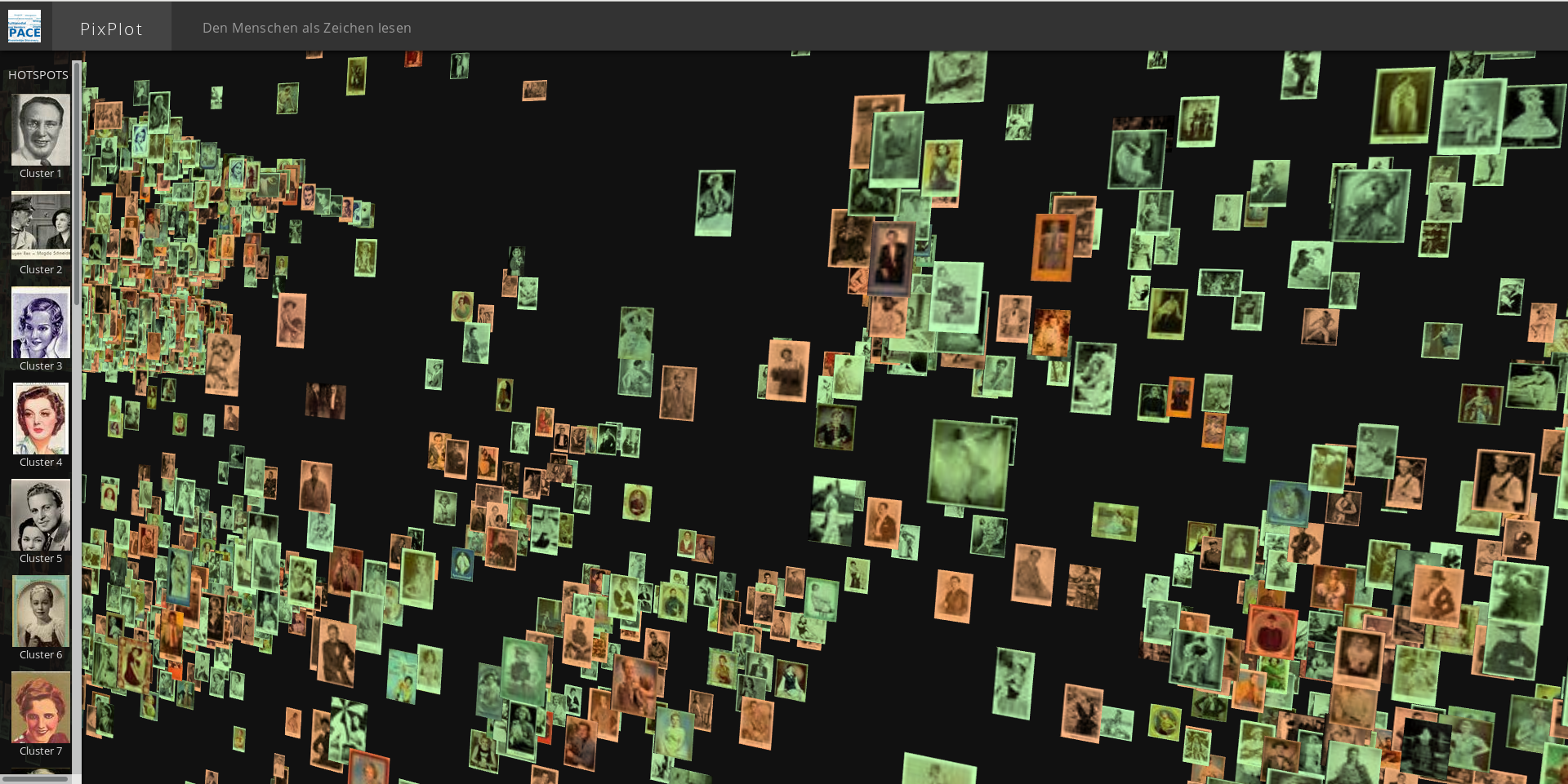
This repository is a fork of the original PixPlot created by the Yale DH lab. In our version, cluster visualisation via different colors is added as well as a preview function which shows the orginal image after clicking on a thumbnail in the 3D window. In order to use this, create the plot_data.json as usual (instructions below) and then add group information to each image and a global group_count. Afterwards, the json should look like that:
    {"atlas_counts": {"64px": 15.0, "32px": 4.0},
     "group_count": 3,
     "positions": [
          ["picture1", 0, 0, 0, 0, 0],
          ["picture2", 0, 0, 0, 0, 1],
          ...
     "clusters": [...]
     }
For the preview function, either create a subdirectory called full in your PixPlot directory and copy the original images to this new folder, or create a symlink pointing to the original image directory:
ln -s /path/to/images/ full
This repository contains code that can be used to visualize tens of thousands of images in a two-dimensional projection within which similar images are clustered together. The image analysis uses Tensorflow's Inception bindings, and the visualization layer uses a custom WebGL viewer.
Dependencies
To install the Python dependencies, you can run (ideally in a virtual environment):
pip install -r utils/requirements.txtIf you have an NVIDIA GPU, consider replacing tensorflow with tensorflow-gpu in requirements.txt. You'll need to have CUDA and CUDNN working as well.
Image resizing utilities require ImageMagick compiled with jpg support:
brew uninstall imagemagick && brew install imagemagickThe html viewer requires a WebGL-enabled browser.
Quickstart
If you have a WebGL-enabled browser and a directory full of images to process, you can prepare the data for the viewer by installing the dependencies above then running:
git clone https://github.com/YaleDHLab/pix-plot && cd pix-plot
python utils/process_images.py "path/to/images/*.jpg"
To see the results of this process, you can start a web server by running:
# for python 3.x
python -m http.server 5000

# for python 2.x
python -m SimpleHTTPServer 5000
The visualization will then be available on port 5000.
Processing Data with Docker
Some users may find it easiest to use the included Docker image to visualize a dataset.
To do so, you must first install Docker. If you are on Windows 7 or earlier, you may need to install Docker Toolbox instead.
Once Docker is installed, start a terminal, cd into the folder that contains this README file, and run:
# build the container
docker build --tag pixplot --file Dockerfile .

# process images - use the `-v` flag to mount directories from outside
# the container into the container
docker run \
  -v $(pwd)/output:/pixplot/output \
  -v /Users/my_user/Desktop/my_images:/pixplot/images \
  pixplot \
  bash -c "cd pixplot && python3.6 utils/process_images.py images/*.jpg"

# run the web server
docker run \
  -v $(pwd)/output:/pixplot/output \
  -p 5000:5000 \
  pixplot \
  bash -c "cd pixplot && python3.6 -m http.server 5000"
Once the web server starts, you should be able to see your results on localhost:5000.
Curating Automatic Hotspots
By default, PixPlot uses k-means clustering to find twenty hotspots in the visualization. You can adjust the number of discovered hotspots by changing the n_clusters value in utils/process_images.py and re-running the script.
After processing, you can curate the discovered hotspots by editing the resulting output/plot_data.json file. (This file can be unwieldy in large datasets -- you may wish to disable syntax highlighting and automatic wordwrap in your text editor.) The hotspots will be listed at the very end of the JSON data, each containing a label (by default 'Cluster N') and the name of an image that represents the centroid of the discovered hotspot.
You can add, remove or re-order these, change the labels to make them more meaningful, and/or adjust the image that symbolizes each hotspot in the left-hand Hotspots menu. Hint: to get the name of an image that you feel better reflects the cluster, click on it in the visualization and it will appear suffixed to the URL.
Demonstrations
| Collection | # Images | Collection Info | Image Source |
|---|---|---|---|
| Per Bagge | 29,782 | Bio | Lund University |
| Meserve-Kunhardt | 27,000 | Finding Aid | Beinecke (Partial) |
Acknowledgements
The DHLab would like to thank Cyril Diagne, a lead developer on the spectacular Google Arts Experiments TSNE viewer, for generously sharing ideas on optimization techniques used in this viewer.
