Join GitHub today
GitHub is home to over 31 million developers working together to host and review code, manage projects, and build software together.
Sign upadding in new network diagram for home page slide #263
Conversation
 SamFritz
added
the
design
label
Feb 8, 2019
 SamFritz
self-assigned this
Feb 8, 2019
 SamFritz
requested review from
ruebot
and
ianmilligan1
Feb 8, 2019
This comment has been minimized.
This comment has been minimized.
codecov-io
commented
Feb 8, 2019
•
Codecov Report
@@           Coverage Diff           @@
##           master     #263   +/-   ##
=======================================
  Coverage   96.39%   96.39%
=======================================
  Files          35       35
  Lines         555      555
=======================================
  Hits          535      535
  Misses         20       20
Continue to review full report at Codecov.
|
This comment has been minimized.
This comment has been minimized.
|
@SamFritz what are the dimensions of the image that was originally exported from Gephi? |
This comment has been minimized.
This comment has been minimized.
|
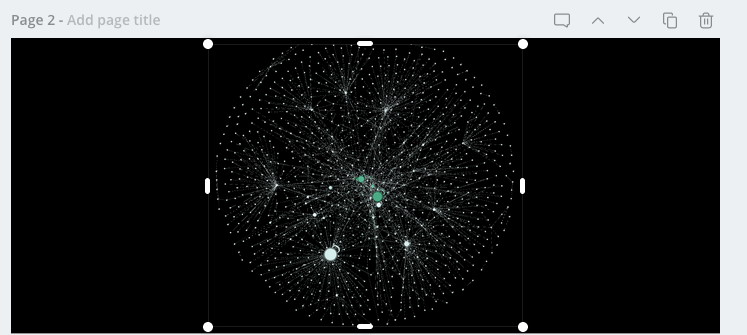
When I exported it gave me a 589 × 485 png |
This comment has been minimized.
This comment has been minimized.
|
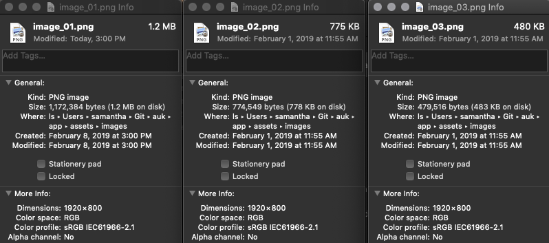
Can you export a new one that has a height of 800? Then drop that on an all black canvas of 1920x800. |
This comment has been minimized.
This comment has been minimized.
This comment has been minimized.
This comment has been minimized.
|
Not wonky. Just want to the image to look good. As it is now, the resolution looks a bit off. |
This comment has been minimized.
This comment has been minimized.
|
Okedoke, I’ll hit Giphy again :) |
This comment has been minimized.
This comment has been minimized.
|
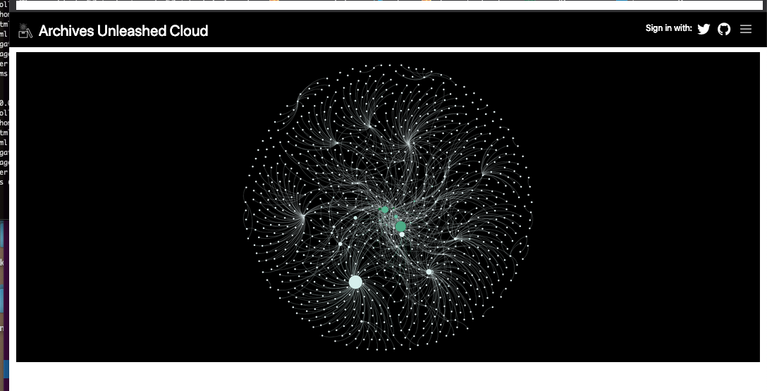
Gephi image was updated and exported at 1920x800 through preview tab for higher resolution. I tested locally and this is what the updated network image looks like on my end |
ianmilligan1
approved these changes
Feb 11, 2019
|
Looks good to me! I think it looks sleek and renders nicely on my end. |


SamFritz commentedFeb 8, 2019
This PR adds in an updated network diagram to the home page slider, based on one of the collections in AUK
GitHub issue(s):
Responds to issue 261
How should this be tested?
Additional Notes:
Learned quite a bit on how to use Gephi, so if there are any style suggestions (colours, node placement, etc.), I'd be happy to make changes. This level of zoom seems to work the best for the slider