Join GitHub today
GitHub is home to over 31 million developers working together to host and review code, manage projects, and build software together.
Sign upClarification around network diagrams #275
Comments
 ruebot
added
the
ux
label
ruebot
added
the
ux
label
Mar 25, 2019
This comment has been minimized.
This comment has been minimized.
|
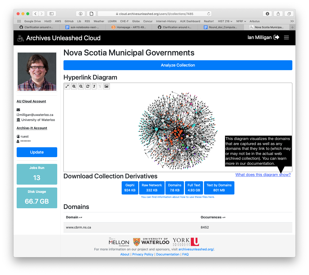
Hmm. Maybe a note in the documentation as well as a hover-over question mark icon to display some help text like we do with the derivatives? |
This comment has been minimized.
This comment has been minimized.
|
Could we be specific about what is the case (we capture every domain and create an edge for every link we find in the web page)? That is a limitation of the network graphs, since I think people imagine the archives to contain everything in Way Back. (That would be really nice, of course!) |
This comment has been minimized.
This comment has been minimized.
|
Just that what is being visualized is the domains that are captured as well as the domains that they link to (which may or may not be in the actual web archived collection). |
This comment has been minimized.
This comment has been minimized.
|
What about something like this?
|
This comment has been minimized.
This comment has been minimized.
|
That works for me! |
This comment has been minimized.
This comment has been minimized.
|
@ianmilligan1 I like that! @edsu does that work? |
This comment has been minimized.
This comment has been minimized.
edsu
commented
Mar 25, 2019
|
Thanks for hearing this part of the presentation, and dropping it in here. You guys are awesome. I like the explanation. I guess I was imagining (at least) two different types of users of this view.
Maybe it would need to be two views? It would be nice if the underlying derivative Gephi file had a property indicating whether it was crawled or not. Then it could be easy for people to examine... |
This comment has been minimized.
This comment has been minimized.
|
Adding a "crawled" or "domain"=1 attribute to the gexf would not be too expensive or difficult. Might be worth considering something in the sigmaJS to indicate a crawl as well (change the text size and/or colour? or the node shape?). |
This comment has been minimized.
This comment has been minimized.
|
My inclination is to not overcomplicate the sigmaJS, as we're fairly limited in what we can add there. In terms of a |
This comment has been minimized.
This comment has been minimized.
edsu
commented
Mar 27, 2019
|
That makes sense to not over complicate the sigmaJS. Maybe I'm going out on a limb, but I think most archivists would want to see what is actually in the collection, rather than a mixture of what is there and what isn't. We have similar quandries in DocNow where we have vis elements that ought to behave slightly differently based on the audience (researcher vs archivist). I think the edge already has a source and a target in the gexf file. A target could be the source of another edge though. Perhaps this isn't simple, and would require post-processing the graph... Just out of curiosity does the SIgmaJS data get created as a artifact of the processing pipeline? Or are the gephi files in some way used to generate it? |
This comment has been minimized.
This comment has been minimized.
|
I think that's probably true, but as you've noted, researchers will also want to see what isn't there as well. So I think providing options in the Gephi file might be a good compromise here? |
This comment has been minimized.
This comment has been minimized.
This comment has been minimized.
This comment has been minimized.
The SigmaJs viz comes from the gexf file that is created by GraphPass during the derivative generation pipeline. If you want me to point you some of the code, let me know. |
This comment has been minimized.
This comment has been minimized.
This comment has been minimized.
This comment has been minimized.
edsu
commented
Mar 27, 2019
|
I think y'all should feel like you can close this ticket. Especially since it seems like #146 covers a known issue. |
This comment has been minimized.
This comment has been minimized.
|
The #146 does seem like the better option. After looking at AUT a bit, it may be slightly more difficult to include the |
This comment has been minimized.
This comment has been minimized.
|
Heh thanks @edsu but I wouldn't sell this issue short.. I think at a minimum we should add some helper text explaining the visualization, and I do like the idea of letting people filter in the Gephi file. |
This comment has been minimized.
This comment has been minimized.
|
Thanks @edsu! @ianmilligan1 want to put in a PR with your work when you get a chance, then I'll start working on #146 again. |
This comment has been minimized.
This comment has been minimized.
ianmilligan1
added a commit
that referenced
this issue
Mar 27, 2019
 ianmilligan1
referenced this issue
ianmilligan1
referenced this issue
Mar 27, 2019
Merged
Explaining graph visualization, partially resolves #275 #277
ruebot
closed this
in
#277
Mar 27, 2019
ruebot
added a commit
that referenced
this issue
Mar 27, 2019
This comment has been minimized.
This comment has been minimized.
|
Deployed #277 to production. |
ruebot commentedMar 25, 2019
During the Team Kompromat presentation at the DC Datathon, @edsu noted that the network diagrams can be misleading. One could assume that the network diagram represents what is in the archive itself that was analyzed. We should clarify that this is not the case. So, what's the best place to do it? A note on the diagram, something in the documentation? Something else?