Join GitHub today
GitHub is home to over 36 million developers working together to host and review code, manage projects, and build software together.
Sign upCreate graphs of dashboard data #290
Comments
 ruebot
added
enhancement
Dashboard
feature
Rails
labels
ruebot
added
enhancement
Dashboard
feature
Rails
labels
Apr 25, 2019
This comment has been minimized.
This comment has been minimized.
|
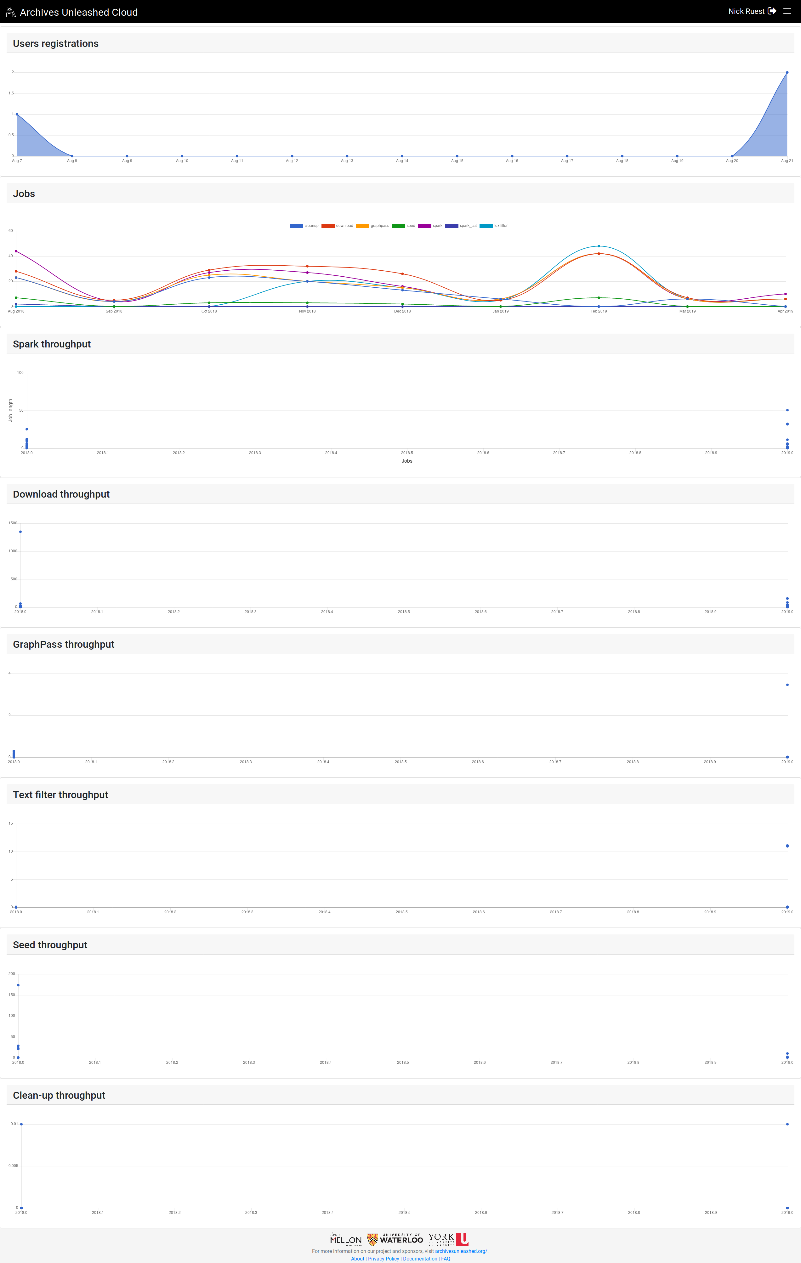
@SamFritz @ianmilligan1 let me know what you think of this: That should be all the bullet points above, plus jobs run over time. I'm using Chartkick.
I'm at York tomorrow, so no rush. |
ruebot
self-assigned this
Apr 30, 2019
This comment has been minimized.
This comment has been minimized.
|
(Oh, you check out that Chartkick page, you'll see the option to download the charts as images. I set that up for each of them, so y'all can use any of those in presentations in the future |
This comment has been minimized.
This comment has been minimized.
|
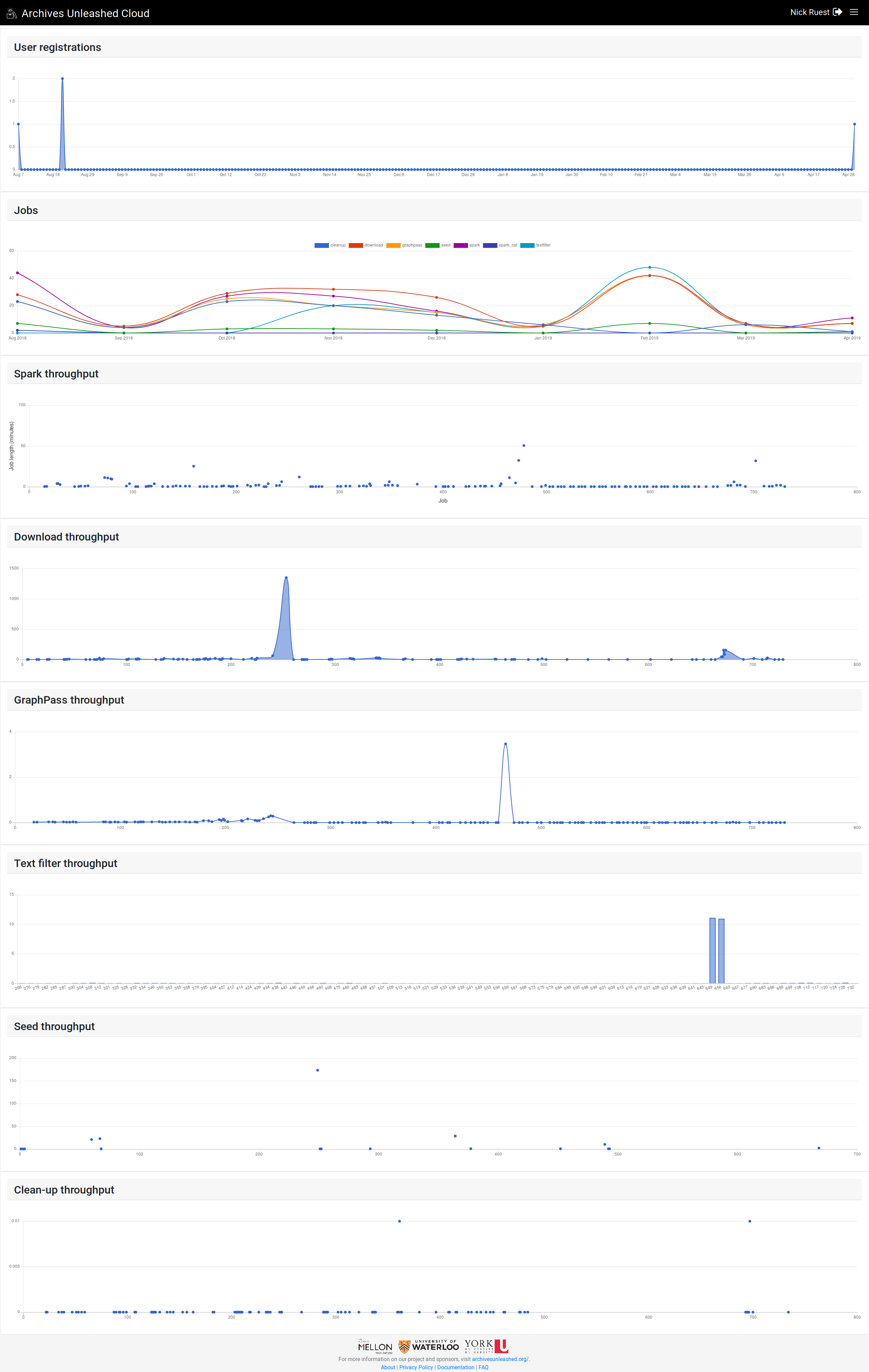
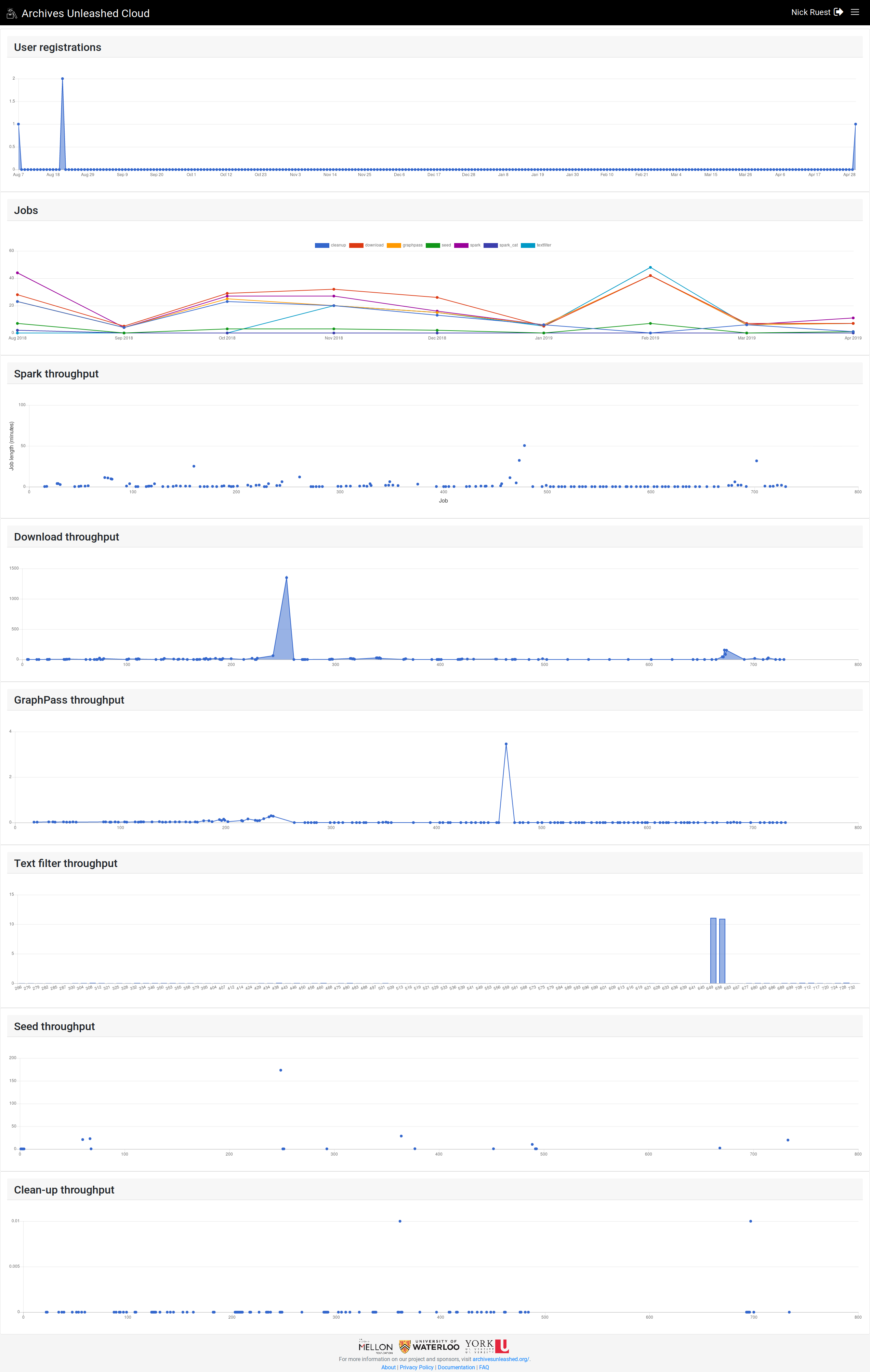
This is looking great @ruebot! Really like how the images are easily downloadable for additional use :) Just wondering for graphs that have an access labeled 2018.0; 2018.1; 2018.2, etc, does the decimal point indicate the day of the year. e.g 2018.3 = January 3, 2018? |
This comment has been minimized.
This comment has been minimized.
|
Throughput graphs updated:
Let me know which of those 4 you like the best, then we can work on axis labels. |
This comment has been minimized.
This comment has been minimized.
|
"jobs" should have smoothing; in fact, none of the graphs should. |
This comment has been minimized.
This comment has been minimized.
|
@lintool should or shouldn't? |
This comment has been minimized.
This comment has been minimized.
|
Sorry - shouldn't |
This comment has been minimized.
This comment has been minimized.
|
Curves/smoothing removed. |
This comment has been minimized.
This comment has been minimized.
|
Also, "throughput" probably isn't the best word to use here for all the "throughput" charges. Those are all just showing how long each job was. This is the method that basically powers all of them: def job_times(queue_name)
jt = Dashboard.where(queue: queue_name)
.where('end_time is not null')
.pluck(:end_time, :start_time, :id)
jt.map { |k, v, i|
Hash[i, TimeDifference.between(k, v).in_minutes]
}.inject(:merge)
end |
This comment has been minimized.
This comment has been minimized.
|
These look great, @ruebot – esp. without curves/smoothing. At a glance it gives a fantastic overview of where we're at with our different processes and elements, which is what we like dashboards to do. As for throughput graph style, I would have a preference for area or line. Scatter requires more effort to read and column is a bit boxy. |
This comment has been minimized.
This comment has been minimized.
|
Ok, I'm going to commit, and push this up to production here in a moment. Then we can do further feedback from there as y'all will be able to interact with it will production data. |
ruebot
added a commit
that referenced
this issue
May 1, 2019
This comment has been minimized.
This comment has been minimized.
|
Updated! Check it out, and drop feedback in here. |
This comment has been minimized.
This comment has been minimized.
|
Caught a couple things that might be helpful:
|
This comment has been minimized.
This comment has been minimized.
|
Maybe "User Registrations" graph should go by month, not day. |
This comment has been minimized.
This comment has been minimized.
|
This comment has been minimized.
This comment has been minimized.
|
These look fantastic, @ruebot - as you'll see from the Slack I was nerding out and excitedly screenshooting. A few thoughts:
That's probably most useful. When we have clusters of sign ups, we can notice it on the jobs dashboard, whereas the "user registrations" I think could give us good long-term data?
Good call – that's probably more understandable at a glance.
|
ruebot
added a commit
that referenced
this issue
May 1, 2019
ruebot
added a commit
that referenced
this issue
May 1, 2019
This comment has been minimized.
This comment has been minimized.
|
New charts look great! Tooltips work really well, the user registrations per month are very handy and good to see our long-term growth, and the throughput and job lengths are legible and really useful to me. |
ruebot commentedApr 25, 2019
We have some info that'd be nice to graph out (or I've just been looking at the AWS Lamda and CloudWatch console too much lately) on a dashboard page.
Maybe: